Say hello to the new Careem! 💚
Your favorite app just got a makeover, and we’re excited to share all the details with you! But first, let’s take a trip down memory lane and see how much Careem’s brand has evolved over the past decade:
Back in 2012, Careem was launched as a budding ride-hailing startup. Not many people knew who we were or the services we offered. Our main priority when creating our initial brand identity was to, first and foremost, inform. We kept our logo simple and straightforward – with one look at our initial design, people recognized the overlap between the service we offered, and our brand name.

Careem’s co-founders, Mudassir Sheikha and Magnus Olsson, pictured with Careem’s first logo in 2012
In the few months after launching, we amended our first logo to incorporate an important visual element: an icon derived from the letter ‘C’ that can be used independently of the brand name, but was still a unique brand identifier.

Careem quickly flourished into Dubai’s leading ride-hailing app. Our customer base was multiplying, our geographic presence was expanding, and our brand was finally ready to grow in tandem. By 2016, we were past the ‘informing’ stage of Careem’s brand journey – ‘Careem’ was now common jargon for booking a ride or a taxi. Our brand name was easily recognizable, but our visual identity wasn’t there just yet.
Careem was due for a new look that had potential for stronger brand affinity among our customers. And with that, our iconic wink and Careem green were brought to life:
Fast forward a few years, and Careem was already one of the region’s most trusted and beloved brands. We became the Middle East’s first homegrown unicorn, were acquired by Uber in a historic tech deal, and most importantly, we were simplifying the lives of millions of customers and Captains from Morocco to Pakistan. Careem was no longer just a Dubai success story, but a regional one.
We also began the shift from being a single-service provider to a multi-service provider – with an ambition to build the region’s first “everything app”. And so, we adjusted our logo slightly to reflect Careem becoming bigger, better, and bolder.
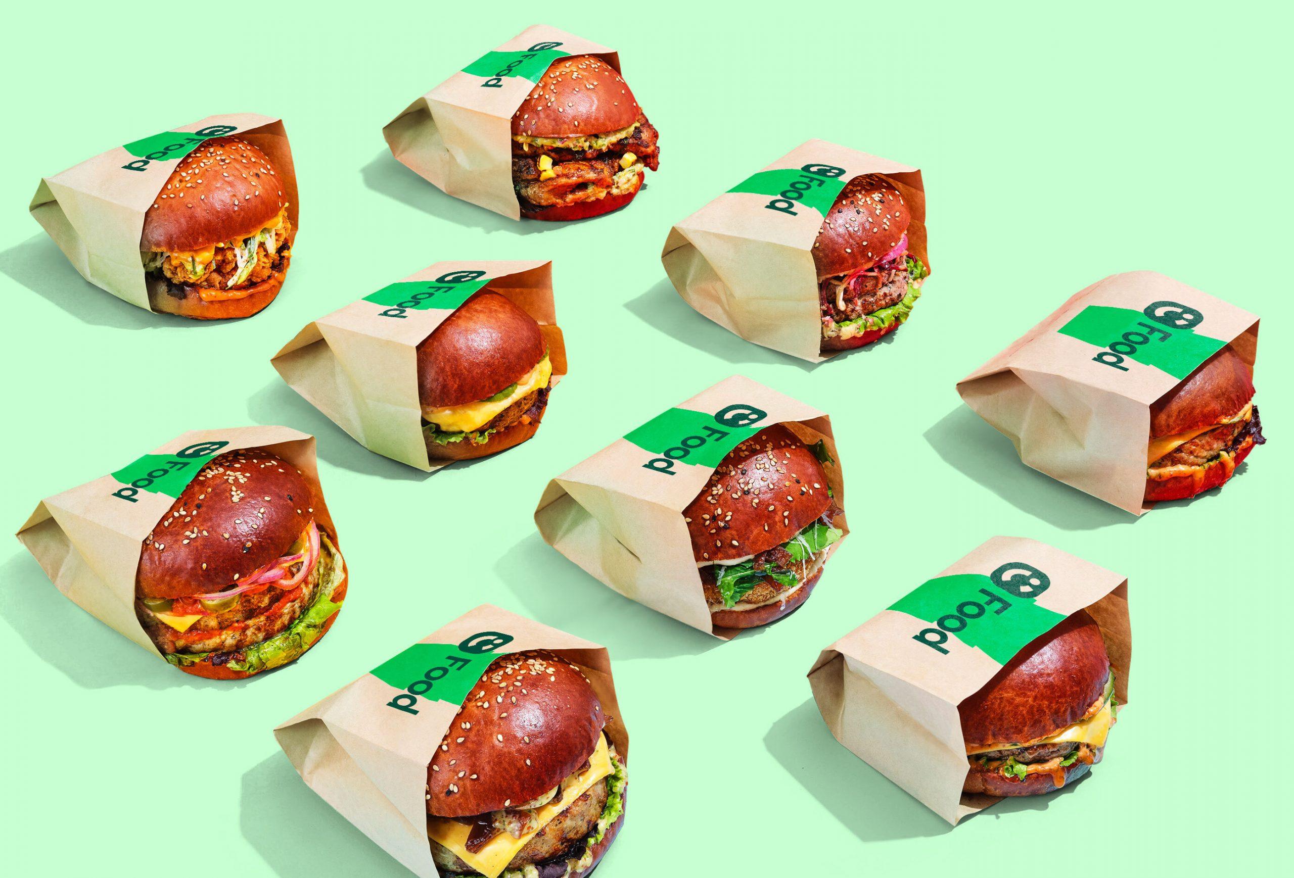
Now, 11 years later, Careem has successfully matured from a ride-hailing app to the region’s first “everything app”. Our brand architecture is no longer linear or one-dimensional. It is an overarching brand house, with services like Careem Food, Careem Quik, Careem Pay, our subscription programme Careem Plus, and other partner services, all under its umbrella.
To empower each service and to reflect the more mature and elevated brand that Careem has grown into – we’re excited to launch Careem’s new brand identity! Our goal when we first began working on Careem’s brand refresh 12 months ago was to give life to the new “everything app”, while staying true to the essence of the brand. This brand refresh will unite product and brand under one experience, and reflect our goal of being an organisation that inspires the region, our communities, and each other.
Say hello to the everything app:
Careem’s brand journey has been quite the ride (pun intended), and we’re so proud of how far we’ve come. We hope you love it as much as we do 💚

